Line Type & Font Size
Two sides of the same coin, really! If you set your font size, you are setting your manuscript line height.
(Real quick note before I get into it all...)
For the purpose of this lesson, I pumped up the intensity of the color in the images below so you can clearly see the Line Types. However, the reality is, the blue and red is much lighter on the finished product. This immediate next image shows reality.
ALSO, you should know that YOU can control the lightness and darkness of the tracing letters (tracing letters are in-line like this page's example.) Swing the gray (or any color, really) all the way from whisper light, to black if you need that for some reason. Go here to scope out the tracing darkness lesson.
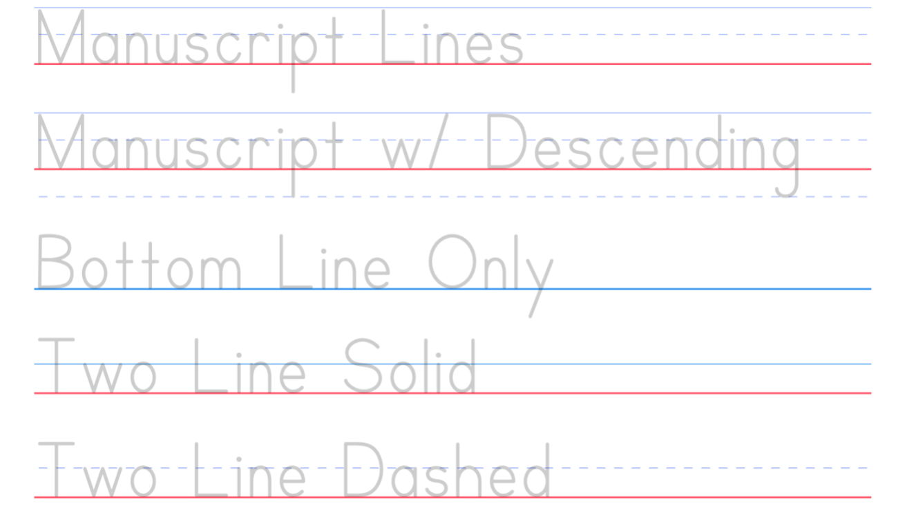
Line Types...
Ditto Sheets offers five line types...
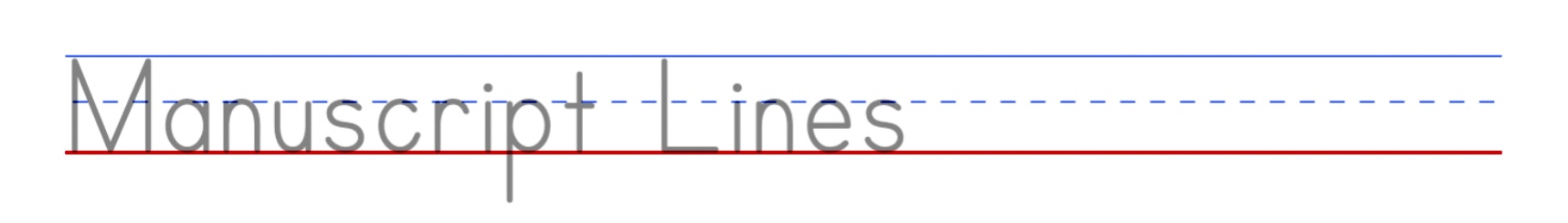
Manuscript
This one is the most conventional handwriting paper I've seen. But that may be because I'm a child of the eighties.
"Three-lined paper, also known as triple lined paper, is lined paper with three typographic guidelines per line.
Handwritten letters should sit on the baseline, with their bodies between the baseline and the midline. Ascenders should go up to the ascent line, and descenders should hang and appropriate distance below the baseline.
This [Line Type] can be very useful to for people... ...for handwriting practice, and make sure the letters are correctly formed and all the right size." (credit)
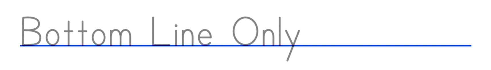
Bottom Line Only
Bottom Line Only isn't terribly complicated, as you can guess. I chose to make it blue this time to mimic conventional notebook paper. With the least amount of scaffolding, older kids will typically use this one, and I speculated that red baseline may not appeal to them if they thought it was a close cousin to the paper they used in kindergarten.
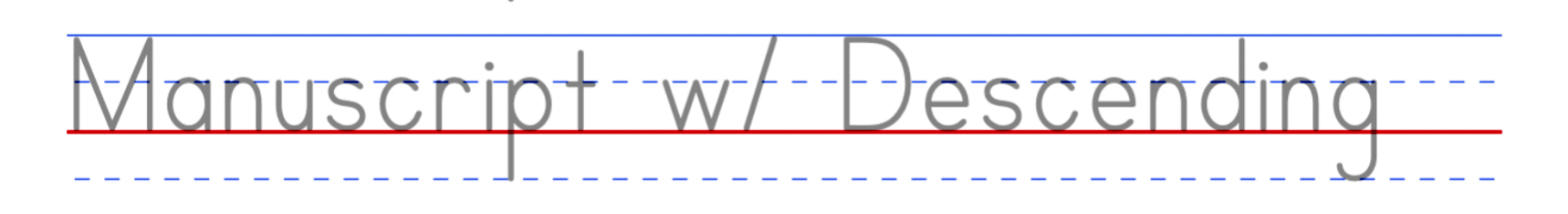
Manuscript Lines with Descending Line
"Four‐lined paper, also known as quadruple lined paper or quad-lined paper, is lined paper with four typographic guidelines per line. The lines top-to-bottom will be a combined ascent line and cap line, a mid-line, a baseline (which is usually slightly thicker, or in a different color), and a descent line." (credit)
Of all the options I've seen, this one offers the most "help" with starts and stops. It also has the most stuff on the page.
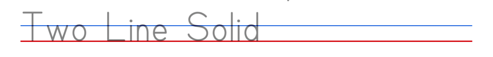
Two Line Solid
Learning without Tears touts two solid lines as the easiest for students to follow, citing that it prevents confusion and promotes neatness. Also saying "Children demonstrate more handwriting control, confidence, and size consistency learning on double lines."
In my opinion, it does seem to offer just enough scaffolding for developing handwriting without cluttering up the page!
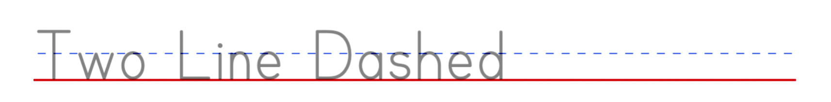
Two Line Dashed
Two Line Dashed is a modification of the simple, two solid lines. I couldn't find any programs that use this specific type of two-line solid and dashed combo. However we decided to include this in our line type collection because I know how parents and teachers often throw the book out the window and trail blaze new ideas all the time.
You guys should email me if you fine a curriculum that uses this type so I can give them a shout out!
Font Size...
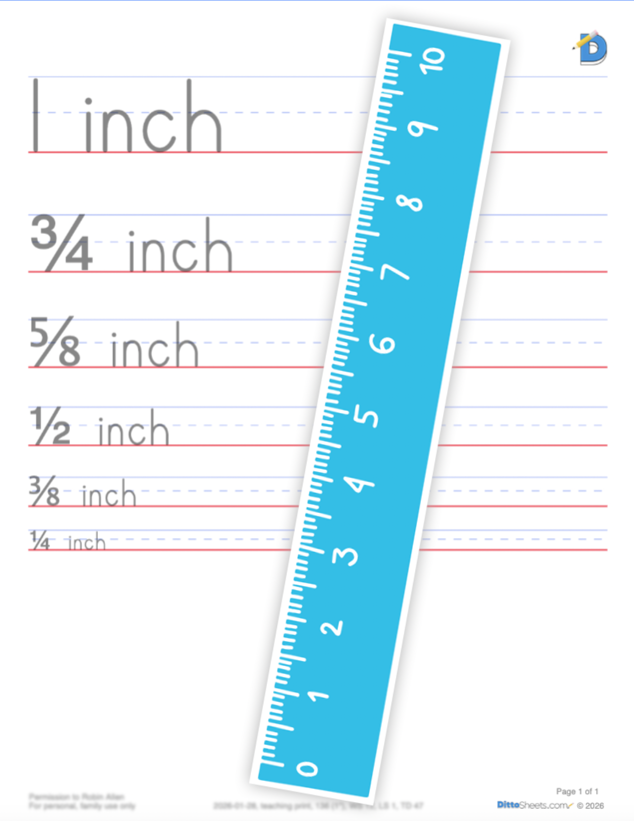
The size of the font is tied to its manuscript paper...
1 inch manuscript paper measures top to bottom (ascent to baseline) SO it follows that the font that sits perfectly on that size manuscript paper will be 1 inch font.
Next, and slightly weirder....
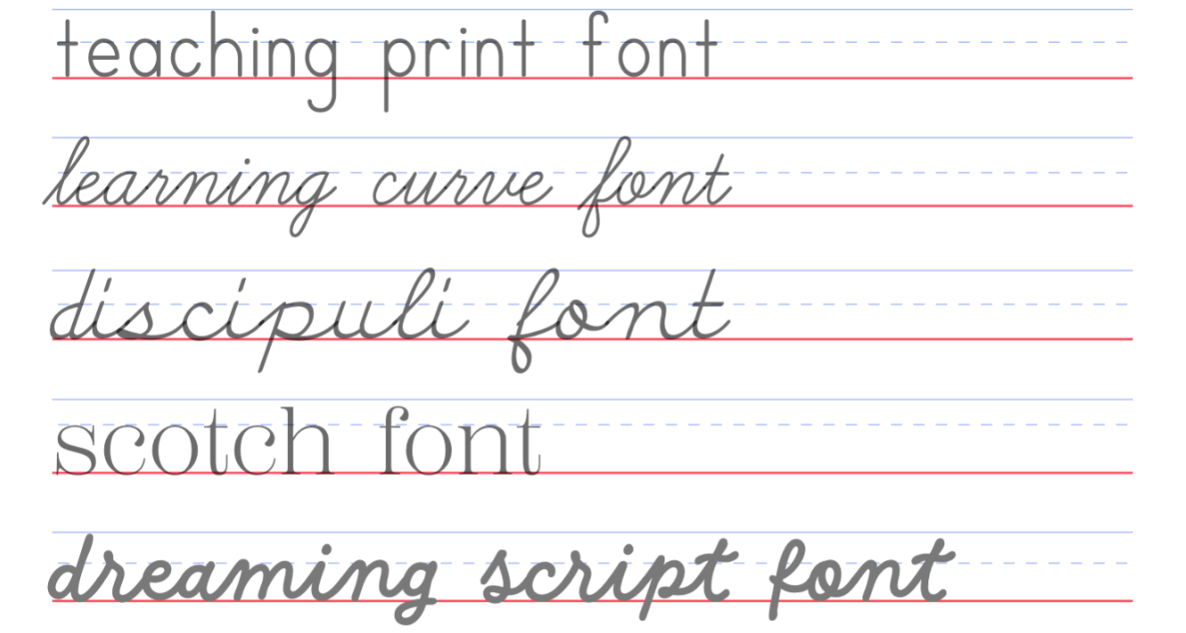
Notice the x-height line on these sample fonts.
The first three are pretty dead center. The second two fonts' x-heights are closer to the top line! The reason is, the font itself determines the exact placement of the x-height line.
Further, some fonts are all willy nilly and the letters don't all sit on the same place. Those are the interesting ones.
⚠️ So while we DO include many rebellious fonts like this, those are not intended to be the fonts of choice for early writers. When kids are beginning to develop their penmanship habits, begin as you mean to go, right?. They will be mimicking your font choices. For the young student, the font demonstrates the "right" way to pen a letter.
The rule-breaking fonts are here for enjoyment. Parents/teachers are welcome to do whatever they want! In our house, after handwriting was no longer a primary concern, I used the funky fonts as a way of mixing things up so kids aren't as bored with copywork.
Happy choosing! 💚